Wednesday, April 2, 2014

Canadian House and Home


all images via Canadian House and Home magazine

A well established fact about me: I love reading. Books are always (and always will be) my first love, but I've also acquired a love of magazines. The original incarnation of Domino was my first love. I managed to save every issue, despite my tendency to recycle, regift, and give away at every opportunity. Domino was my gateway into interior design magazines and led me to Canadian House and Home.

Have you ever picked it up? It's a such a good magazine with a real variety of homes and styles featured. Most of the homes actually feel lived in and not overly decorated, with a feeling that you might knock on one of the owner's doors and actually see the house looking like it did in the magazine. A lot of the designs pay homage to the character of the house and geographical location, which seems like a rarity in shelter mags sometimes. Plus, there are always fantastic recipes in the back, some well-priced products throughout, and fun renovation features. For the most part, it seems like attainable design with tons of great ideas and inspiration. Oh, and despite my little teaser, all of the rooms aren't always black and white. 

Tuesday, April 1, 2014

April Wishlist


Book from Amazon | Bioderma from Amazon | Surf Spray from Sephora
Greenwich sunglasses from Warby Parker | Shift dress from Madewell
Wimberly tray from Biscuit Home | Earrings from BaubleBar

I'm pretty sure I will be the last person to read this book, but I'm always about jumping on book bandwagons. I also can't wait to check out the movie once I'm done reading. 

Over the past couple of weeks, I have gotten obsessed with Into the Gloss. Just before Christmas, I noticed some "fine lines" on my forehead and started looking into all things skincare. I'm attempting to go the organic/natural route, and Bioderma still loosely fits in this category while being a French girl's go to product. Along the same lines, I'm rocking a legit bob as of last week, and my hairdresser recommended air drying my hair and then adding some surf spray, which is perfect for warmer weather when I can't handle drying my hair.

I tried on the Madewell shift dress last weekend, and immediately spent some Christmas gift cards on it. I love sleeveless shift dresses in the humid Texas weather. I recommend sizing down if you get it (which obviously added to the benefit of the dress). Anytime I get to size down is a good day in my book! Plus, I need some Warby Parker sunglasses to complete the look. I wanted them for Christmas when they were part of the limited edition Goop collaboration, and I was really excited to see them on the Warby Parker website the other day.

My favorite time of year is Bluebonnet time, and I couldn't resist the Wimberley tray from Biscuit home. We planted some bluebonnets in the backyard, and hopefully we will have bluebonnets inside and outside this year!

Thursday, March 27, 2014

The Stuff Dreams Are Made Of


all images via Lacquered Life

I found Olivia's blog Lacquered Life, a few months ago, and it quickly became one of my favorites. She has a background in historic preservation and lives in Charleston. (I know. I'm jealous too.) Her blog is a delightful mix of her life in Charleston, her knowledge of decor and architecture, and great finds for the home. Her home was published in the March issue of Southern Living, and she recently posted more information and sources on her blog. To say I'm obsessed would be an understatement. Our living room is basically a sad attempt to be like Olivia's, and I love her mix of textures and traditional pieces with a nod to more laid-back elements like seagrass. Of course, that kitchen...the natural light is my favorite element, but I also love how the brass accents feel traditional rather than trendy. The cream on top? Her outdoor room would be my ideal place for late afternoon cocktails and grilling out with friends. I could go on and on about my favorite parts, but if you're obsessed to, check out the posts on her home here, here, and here

Wednesday, March 26, 2014

Spring


Bench from Furbish | Pillow from Society Social
Heels from Nordstrom | Headboard from Furbish | Flats from Zara
Clutch from kertis | Pillow from sparkmodern

It's here! When winter has been bad in Houston, then I know it's been awful everywhere else. I've never looked forward to sunshine and warm weather more than I have this year. If I complain about the heat this summer, you are more than welcome to remind me how I felt in January and February.

A few weeks ago, in the middle of 40 degree rainy weather, I switched all of our pillows out for brighter colors and traded our candles for lighter, more floral scents. While money and objects may not buy happiness in the long run, they definitely made me much happier at home in the short term. I'm partial to blue and white (always) with a little bit of green thrown in during the warmer months. I wish I had a Peter Dunham fig leaf pillow in every single room, and I would take the Furbish headboard in a heartbeat. Or the Society Social Santorini pillow, which I'm trying to convince my sister to get in pink or blue for her apartment. Throw in a clutch and a little bit of sunshine, and I'm happy. Cue up the Pharrell song now...

Tuesday, March 25, 2014

Mid Century


all images from Lucy Snowe Photography 

While looking on etsy the other day, I stumbled across Lucy Snowe Photography. I keep going back to her images, and each time, I find a new one to love. Her photographs of swimming and architecture are especially haunting and have such a "Mad Men" quality to them. I love the simplicity of the images, and the sharp color contrasts in these photographs. Makes me want to move to California or mix a martini.

The shop has a variety of photographs from Still Life to Landscapes and Animals. I'm always partial to Still Life photography, which I blame on my obsession with Dutch painting, and I would be hard-pressed to narrow down my favorites. If you're looking for art (and I mean who isn't?), I definitely recommend checking it out.

Wednesday, February 26, 2014

Higgeldy Piggeldy Stripe


Remember when I teased about my bathroom oh, like a year ago? Now I'm finally showing it to you, and making a promise that in the future, if I tease something, I'll follow through a little bit quicker!

In our house, we have a super tiny bathroom under the stairs. When we bought the house, the bathroom was eggplant purple, and I knew that was going to have to change. I love the idea of bathrooms with a lot of color and/or pattern, and when I saw Anna Spiro's wallpaper collection, I knew that was exactly what I wanted. Thanks to the sleuth work of Jessie from The Long and Short of It, I found out you can order it in the US by calling Porter's Paints in California. I'll be honest, the wallpaper was a bit of a splurge, especially since we had to add shipping from Australia, but we knew it was a really small space. 

It was the best decision, because we both really love the way the bathroom looks now. When we were discussing colors, I knew that skewing towards a blue and orange bathroom in honor of my husband's alma mater was the way to get what I wanted, and I am so happy with the bright orange. We added some art that I had purchased a couple of year's ago, and I also added a picture to give you an idea of how teeny tiny the bathroom is based on the faucet. Seriously, the soap is bigger! 

Now, if anyone wants to go in on some of Anna Spiro's wallpaper in one of the blue colorways and wants to send a roll my way (I'll share the shipping cost!), I know exactly where I would put it.


Sources: Wallpaper: Porter's Paints | Sconce: Shades of Light | 
Mirror: Target (not available) | Artwork: Helena Wurzel 

Tuesday, February 25, 2014

Real E-Stalking


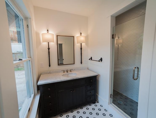
Even though we have a house that I love, I cannot stop looking at Houston real estate listings. I love having a peek at other people's houses and getting ideas from the way Craftsman homes have been updated or decorated. This house is one of the best examples I've seen lately of an updated Craftsman. The owners went with a Spanish bungalow style, which although it's pretty common in other parts of the US, isn't something you see much here.

My mom commented last time she was here that I have an obsession in my house with marble, subway tile, and hexagonal tiles. Since our home isn't that large and fits in a certain period, I really gravitate towards consistently across rooms, and that's what really appeals to me about this house. I love the attention to detail with the tiles and the muted but consistent color palate and fixtures. And those exposed beams, ya'll. It's such a good background to add in fun furniture and color. Plus, who wouldn't want that shower? Looks pretty luxurious for a house this size!

Monday, February 10, 2014

Chinoiserie Wallpaer

image via House Beautiful

image via Ruthie Sommers

First of all, being a true child of the 80s and 90s, I love wallpaper. I know a lot of people in the design world go mad for de Gournay, but I'll admit it isn't really my thing. I think the price tag always pushed me away and the idea that it seemed like it belonged in a octogenarian's formal parlor in Paris or New York. However, I keep seeing images (like the ones above) that are slowly changing my mind. I think the mix of textures makes them a little more my style and doesn't seem as overpowering. 

Then, I saw the house Sara Gilbane designed in this month's House Beautiful, and I became obsessed with the idea of painted wallpaper. Or, in the case of Gilbane's design, a mural painted over grasscloth. 

image via House Beautiful

This weekend, I came across Domesticate's new wallpapers on Spoonflower. She started with the idea of de Gournay wallpaper and created some really beautiful wallpapers. She created really feminine and beautiful colorways, and they look so much more luxe than the price point. Can you image how pretty they would look in a dining room or powder room? Even framing them as panels would be amazing.


I keep imagining Jenny peony on mist in our master bedroom, but Kyle vetoed the option. Until I can convince him, maybe I can convince one of you, because I will just have to stick to an iphone case from her Society6 shop.


Saturday, February 1, 2014

Ikea Rast Hack

I am no DIY queen by any stretch of the imagination, but the one thing I can do is paint furniture. I was terrified of painting furniture, but after a bad experience with a professional restorer, I decided to try it myself. Kyle and I have painted a handful of things around the house, and developed a method that seems to work pretty well for us. Basically, if I can paint furniture then you definitely can paint furniture.

Step 1: Sand the piece of furniture. Kyle and I bought a sander on sale at Home Depot, and we do a light sanding over everything (even if we buy it from Ikea). I don't worry about getting the paint off of something, just making sure that I have a smooth surface. 


Step 2: Prime the surfaces that you want to paint with one coat of primer. We use Zinsser Bull's Eye Primer from Home Depot and always, always, always use 4" mini foam rollers for priming and painting. Our technique isn't the most environmentally friendly, but we throw away the roller after each coat of paint/primer. We only do one coat of primer, because this stuff covers really well.


Step 3: Paint the surface with matte paint. We used Benjamin Moore Gentleman's Gray for our Rast dressers. Every single time I go to the paint store and ask for this, they tell me I'm crazy and make another suggestion. Here's my reasoning: when I put the polycrylic on during the last step, using matte paint helps me to see the parts that I've missed. If they tell you you're crazy, just smile and nod politely. I paint with the foam rollers again for this step. I have read where some people sand the furniture down after priming and again after painting. Kyle and I felt that this was a little too time consuming for the results we saw. We sand down any parts that are uneven or drips between coats of primer and paint. In all honesty, as we've gotten better at painting, we are usually able to cut out the sanding altogether.


Step 4: Paint the surface with a second coat of paint. Again, feel free to sand down (by hand) any places that are uneven or have drips. I let the paint and primer dry between 4 and 6 hours between coats.


Step 5: After the paint has dried for 4-6 hours, I get a regular paintbrush and put on Minwax water-based polycrylic. It's super important when you buy this that it is water-based and clear satin. Oil based will leave a yellow colored finish, but the water-based polycrylic will dry clear and just make your furniture shiny looking. The polycrylic helps to protect the paint so you won't have scratches and marks on it. In my experience, if I see something on the furniture, a damp towel washes it off. It also gives it a more lacquered look, which I really like. You want to make sure you have a new or really clean paintbrush (preferably small to medium size) for this step. I like to put the polycrylic on thickly and then go over the area with even, linear brushstrokes. Kyle gets less paint on his brush and always uses even, linear brushstrokes. His method probably looks a little better in the long run, but mine is faster. Ideally, you want to do two coats of this (letting it dry 4-6 hours in between) to make sure the furniture is evenly covered. If it is a piece I know won't be used often or in direct sunlight, I have sometimes just done one coat.


Step 6: For the rast hack, we didn't put on the knobs provided with the dresser. We bought these Martha Stewart knobs from Home Depot (6 for each dresser). Then, Kyle measured the distance between the screws, and used the holes for the provided knobs to measure an inch and half on each side from the center of the holes. He drilled holes that matched the size of the screws provided from Home Depot, and we put the pulls on. We didn't fill the original holes, because you really can't see them once the knobs are on and the dressers are in place.


Et voila! Our new guestroom bedside tables... 


Total Cost: About $70-75 per dresser for including paint, brushes, and pulls.

Thursday, January 23, 2014

Around Here


Brass Knobs  - I'm jumping on the brass bandwagon with these cheapies from Home Depot. They're perfect for the Rast Hack I'm planning for the guest room and possibly for the kitchen update Mom and I are working on right now.

Monuments Men - History AND art? Sold. This book reads more like a work of fiction, and I highly recommend it before the movie comes out in February. I'm just having a hard time trying not to picture George Clooney as I read.

Juliska Country Estate  - A little Christmas gift from myself, I'm working on building a collection of these for the kitchen. I can't tell you how much better they make Monday breakfasts.

Phone Case - Can you tell I like blue and white around here? I'm obsessed with my new phone case from Note to Self: The Print Shop. I can't resist a buffalo check, it's still thin enough to keep my phone from feeling bulky.
Related Posts Plugin for WordPress, Blogger...